Home
Home
Home
Home

Earning Screen Redesign

Earning Screen Redesign

Redesign the price breakdown page to clearly communicate how drivers' earnings are calculated, building trust

The major problem faced in the earnings screen

Drivers' frequent use of the earnings section indicates a desire to track their pay

Missed Opportunity

We can improve driver satisfaction and trust by redesigning how earnings information is presented.

Focus on Clarity

The information architecture and presentation within the earnings section likely need improvement.

Scope of Improvement

By revamping the earnings section, we can improve driver understanding of their pay, reducing confusion and frustration. This will ultimately lead to increased trust and loyalty.

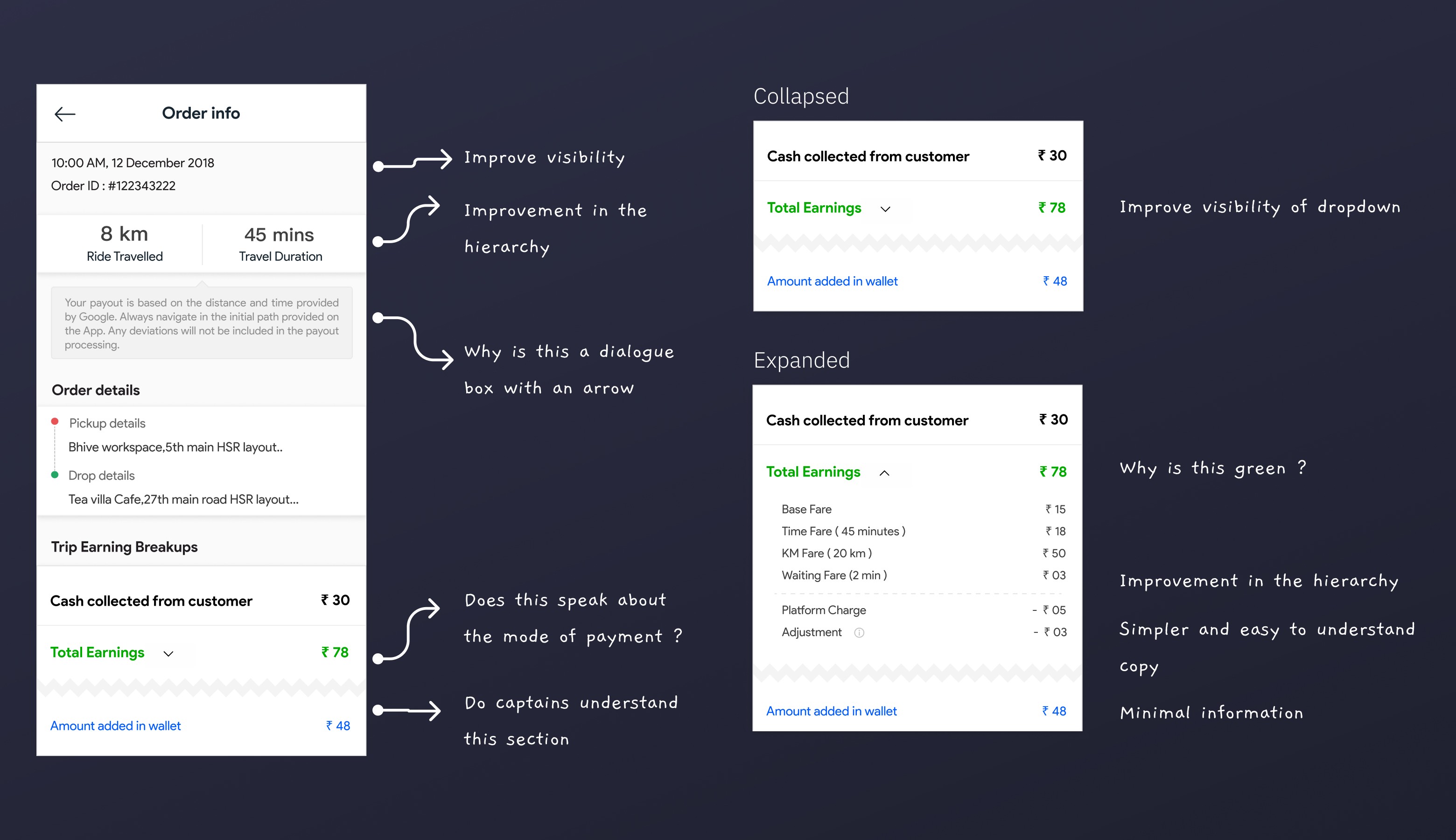
How does the current design look within the app?

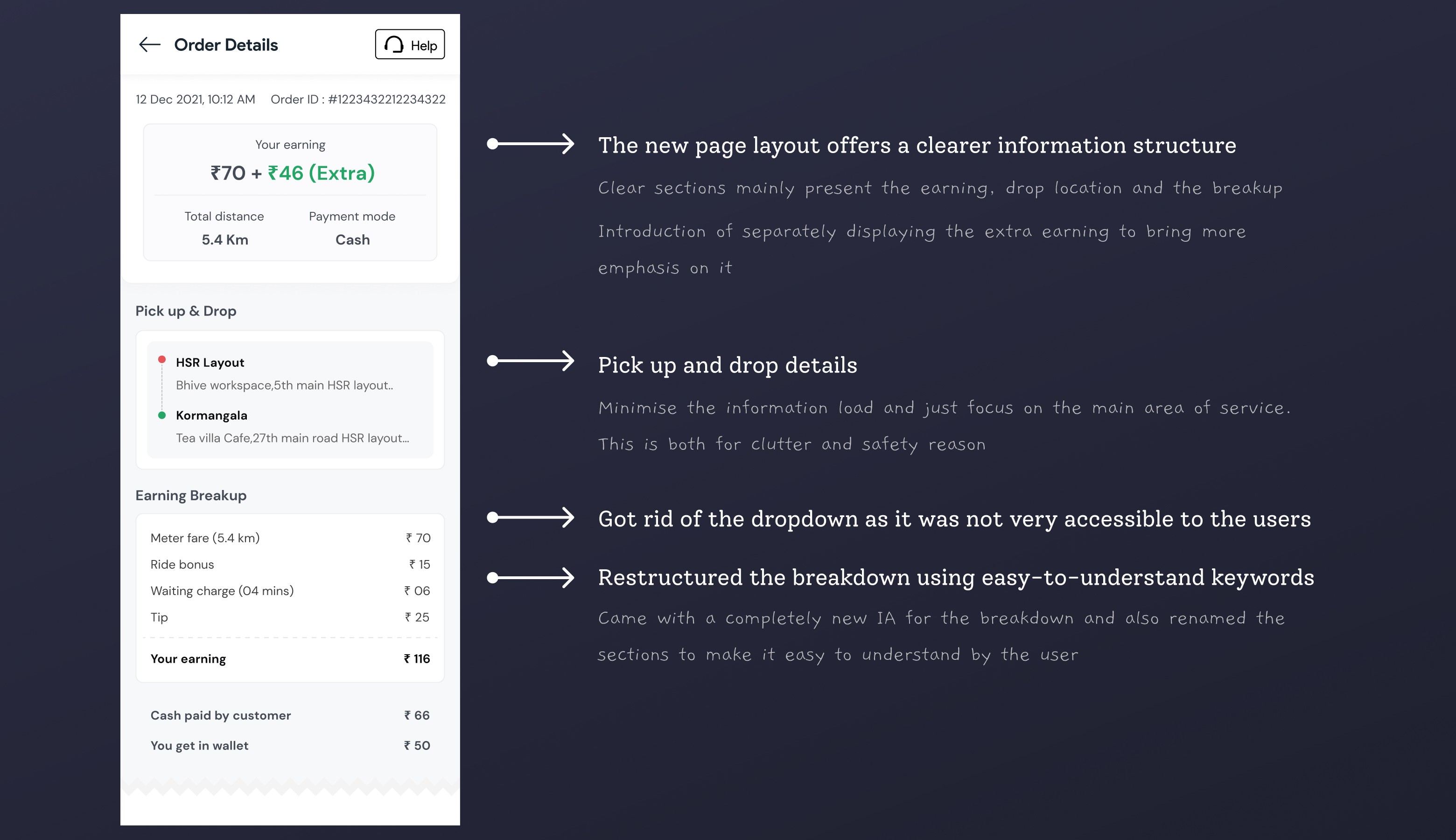
Let's check out the new design!

User testing

After prototyping the user flow and gathering feedback on the redesigned screen, we identified the following observations:
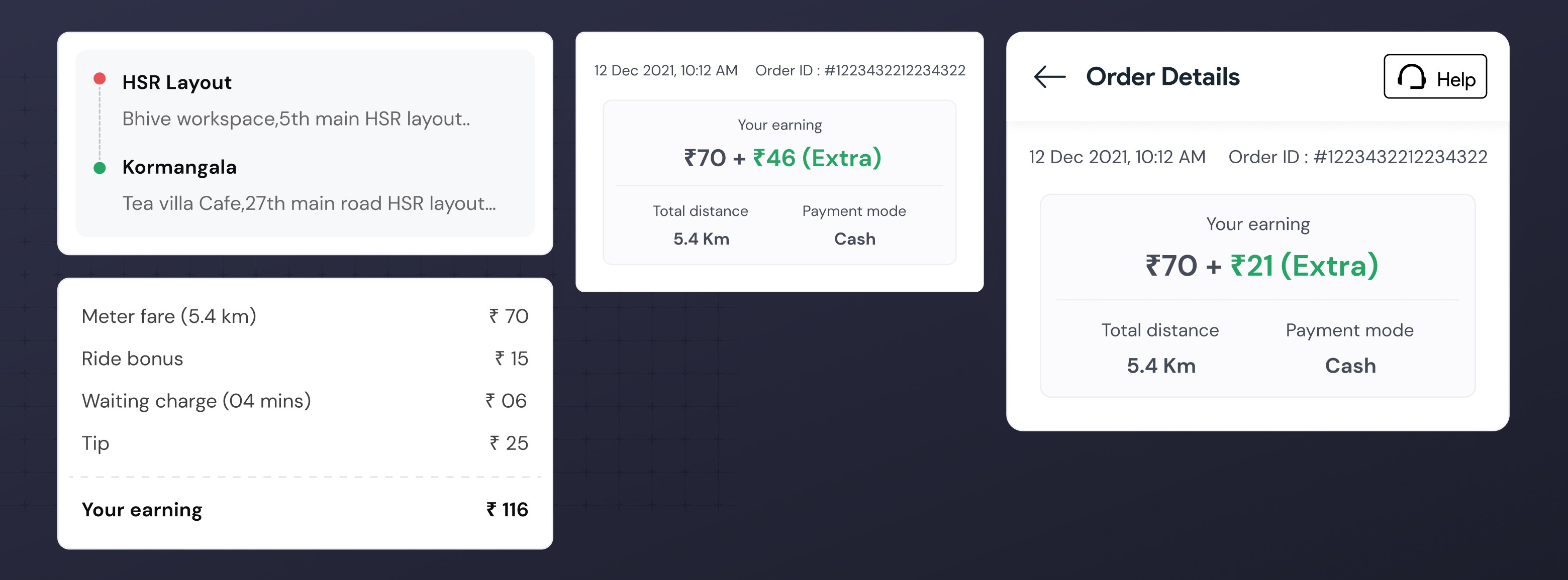
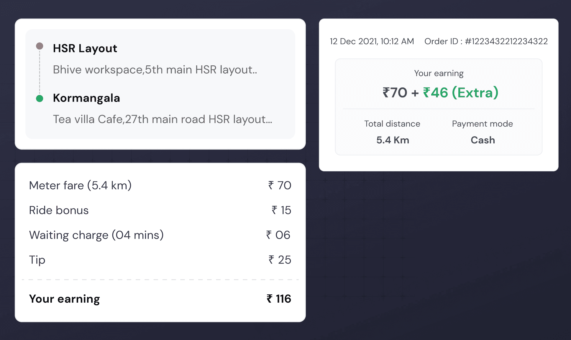
Enriched IA

Riders easily understood their ride earnings. This was evident by drivers mentioning the waiting charges deposited in their earnings

Transparency

The prominent display of an 'extra earnings' section enhances user delight

The final Earning

By the end of the ride, drivers had a much clearer understanding of the final amount deposited in their account after all deductions were applied

Overall Ratings

We received 35% better ratings on the new screen compared to the previous one, based on user experience

That was just a quick peek!

Interested to discuss the project in detail?